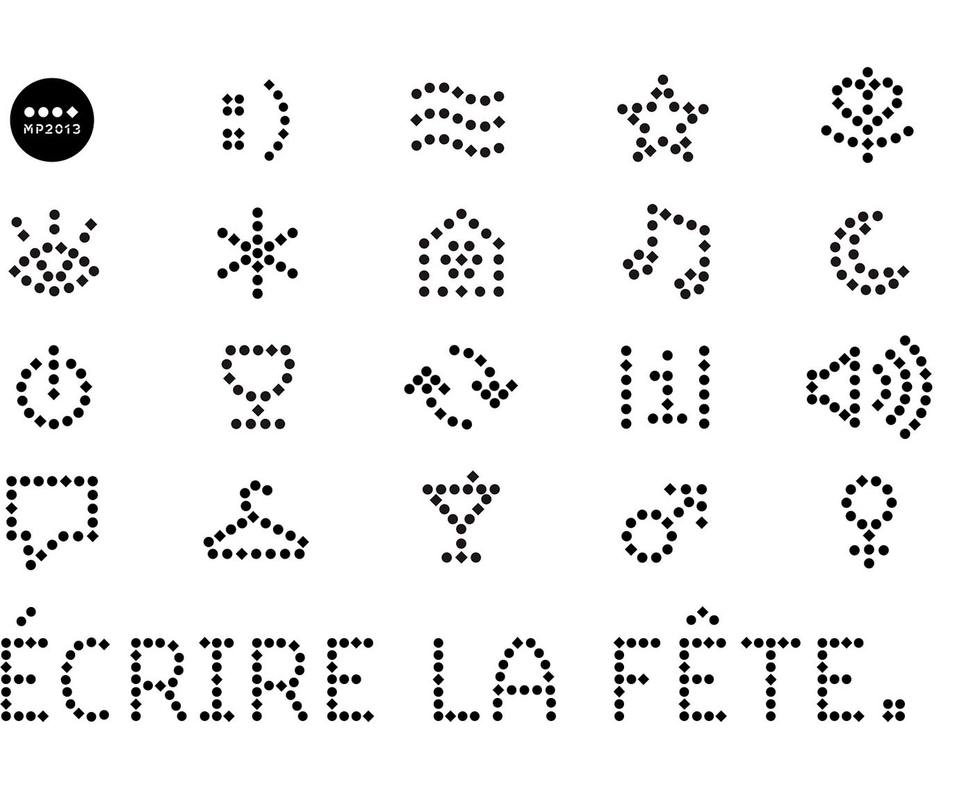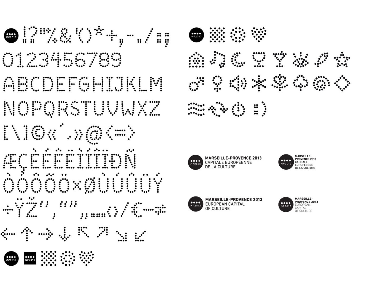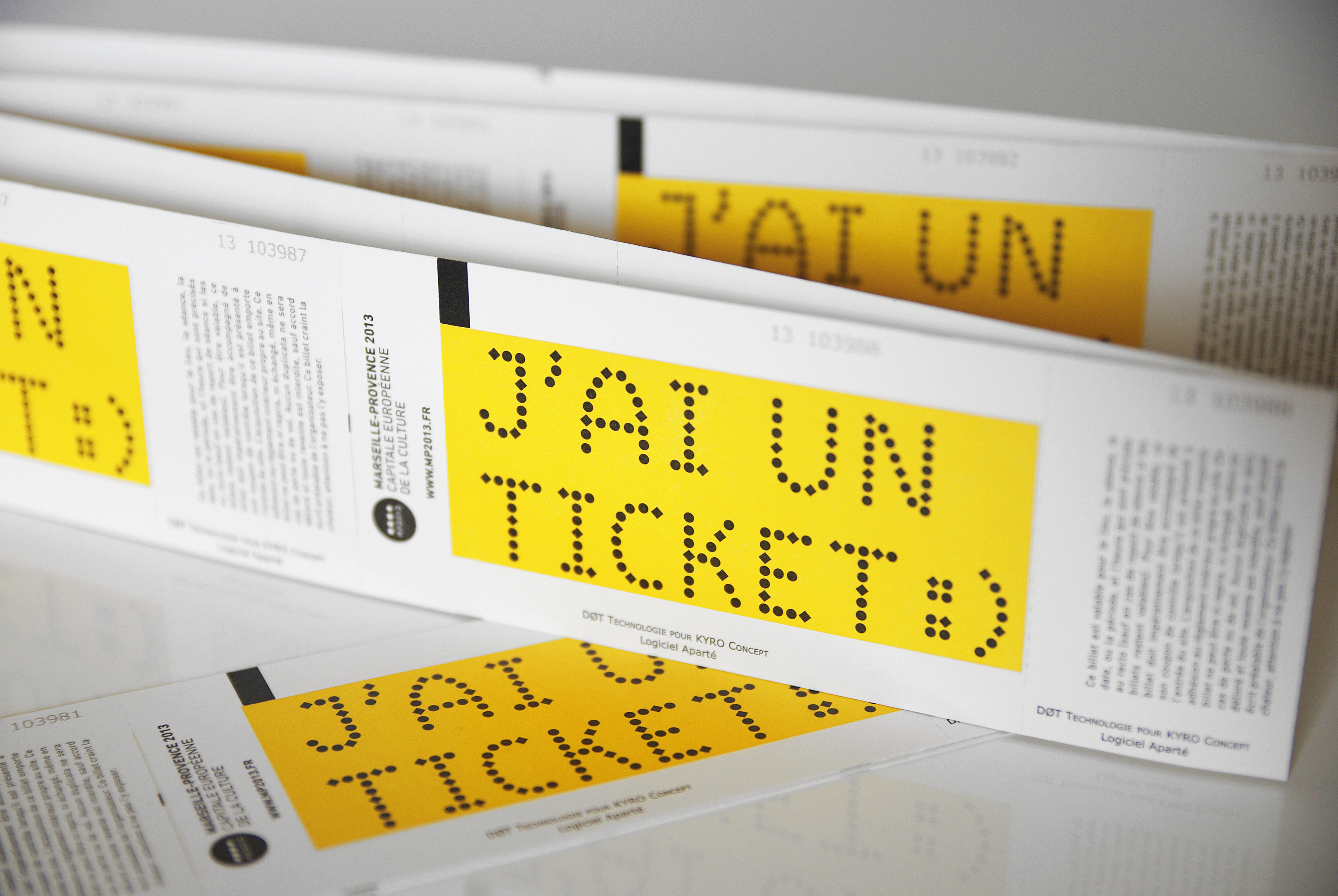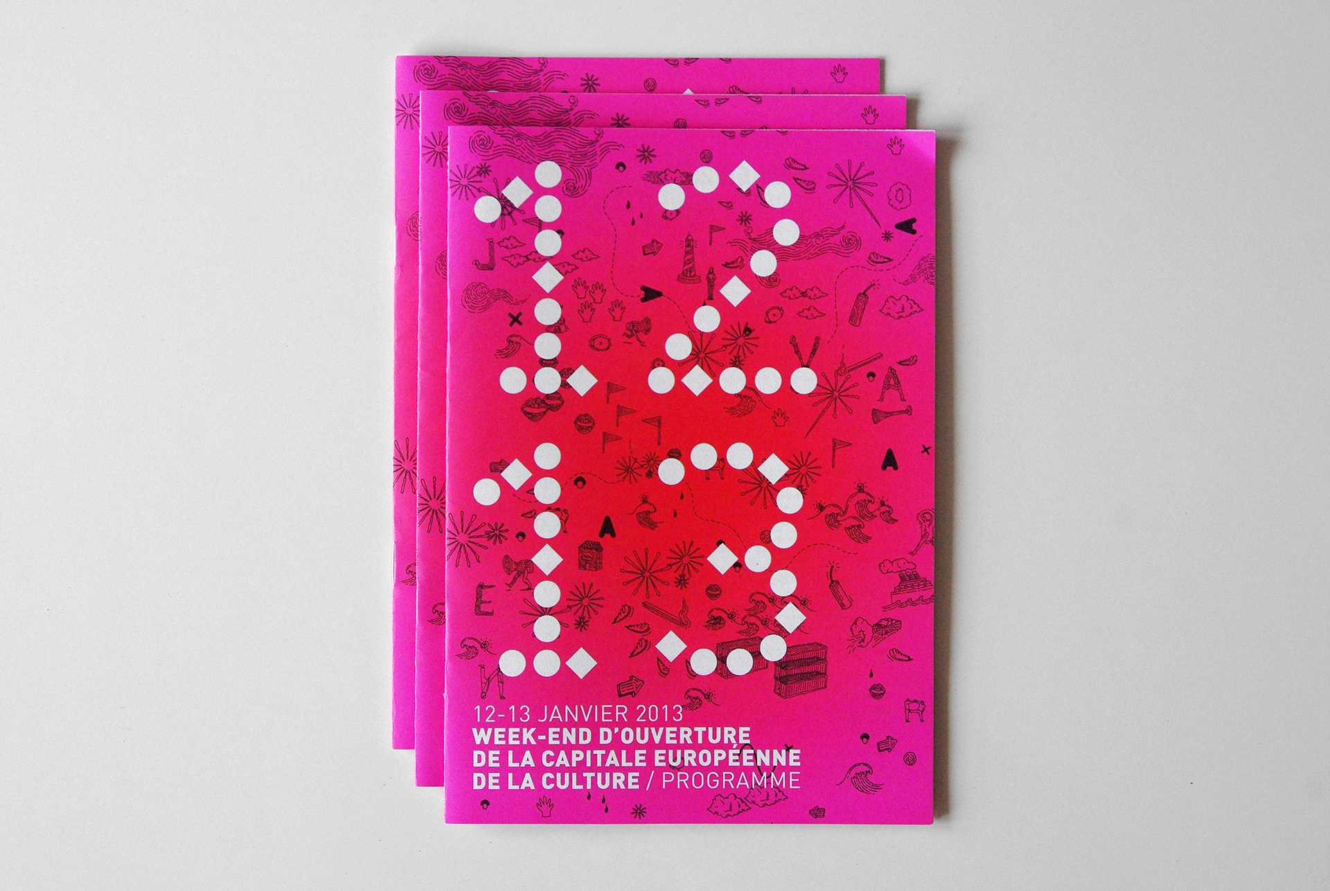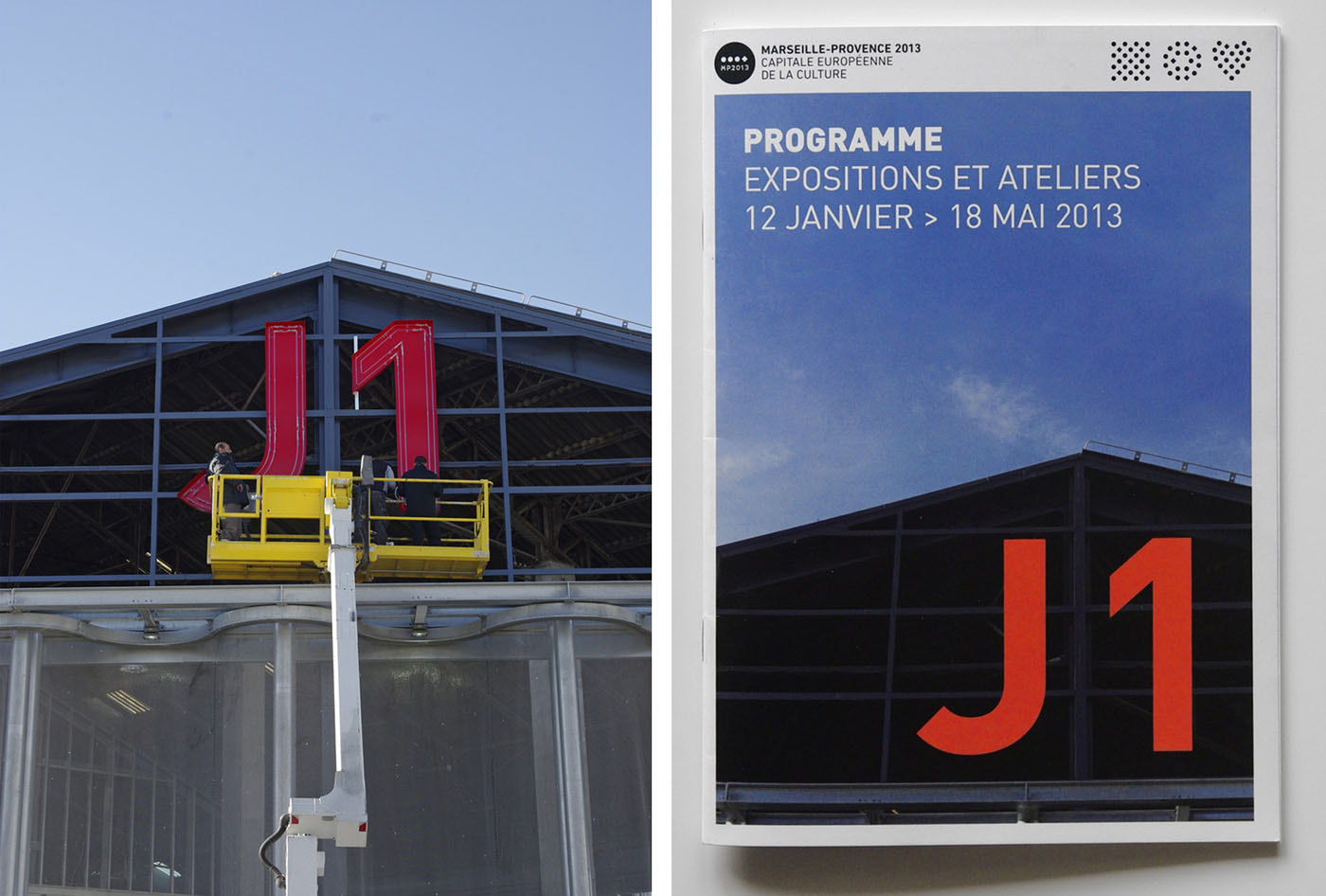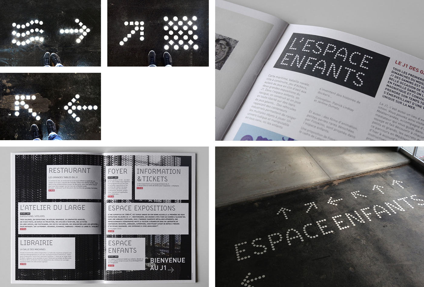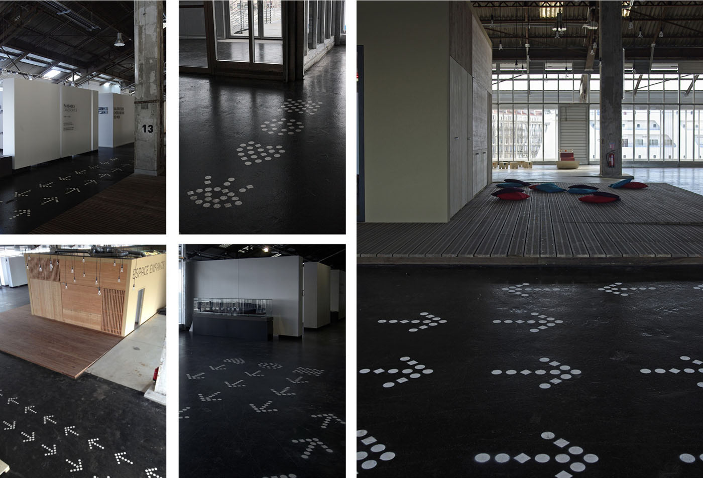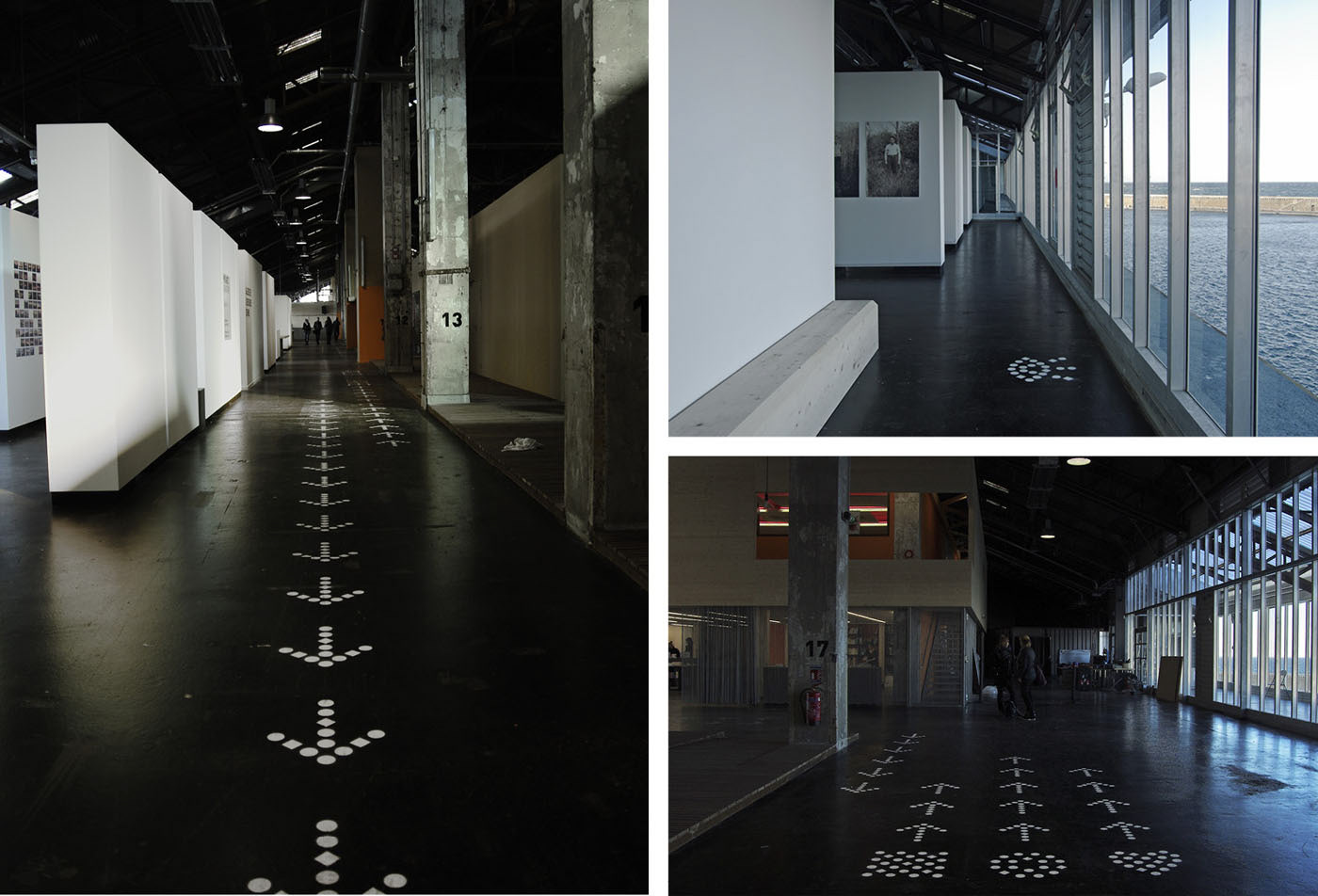
MP-Dot typeface and the icon set.
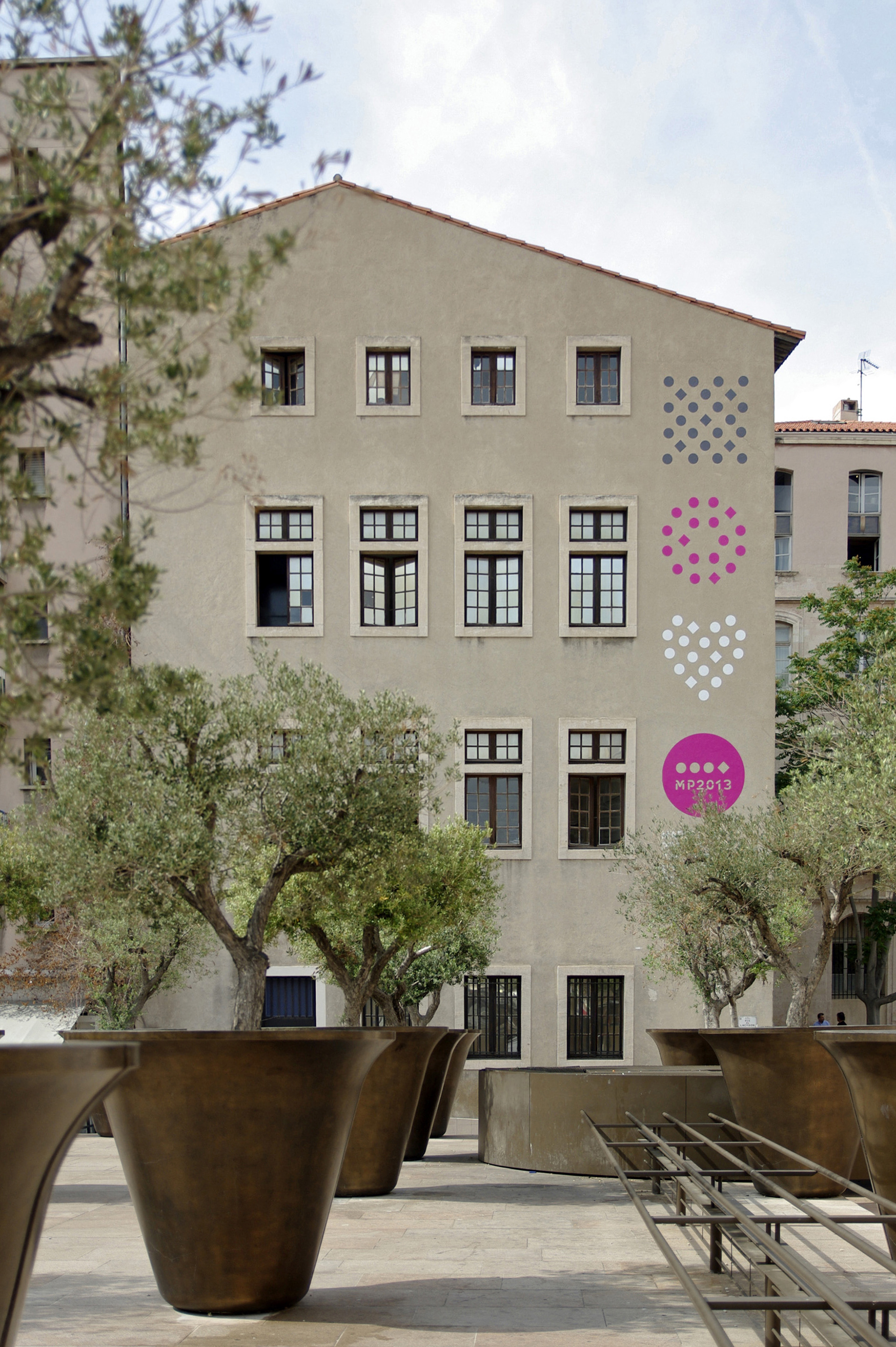
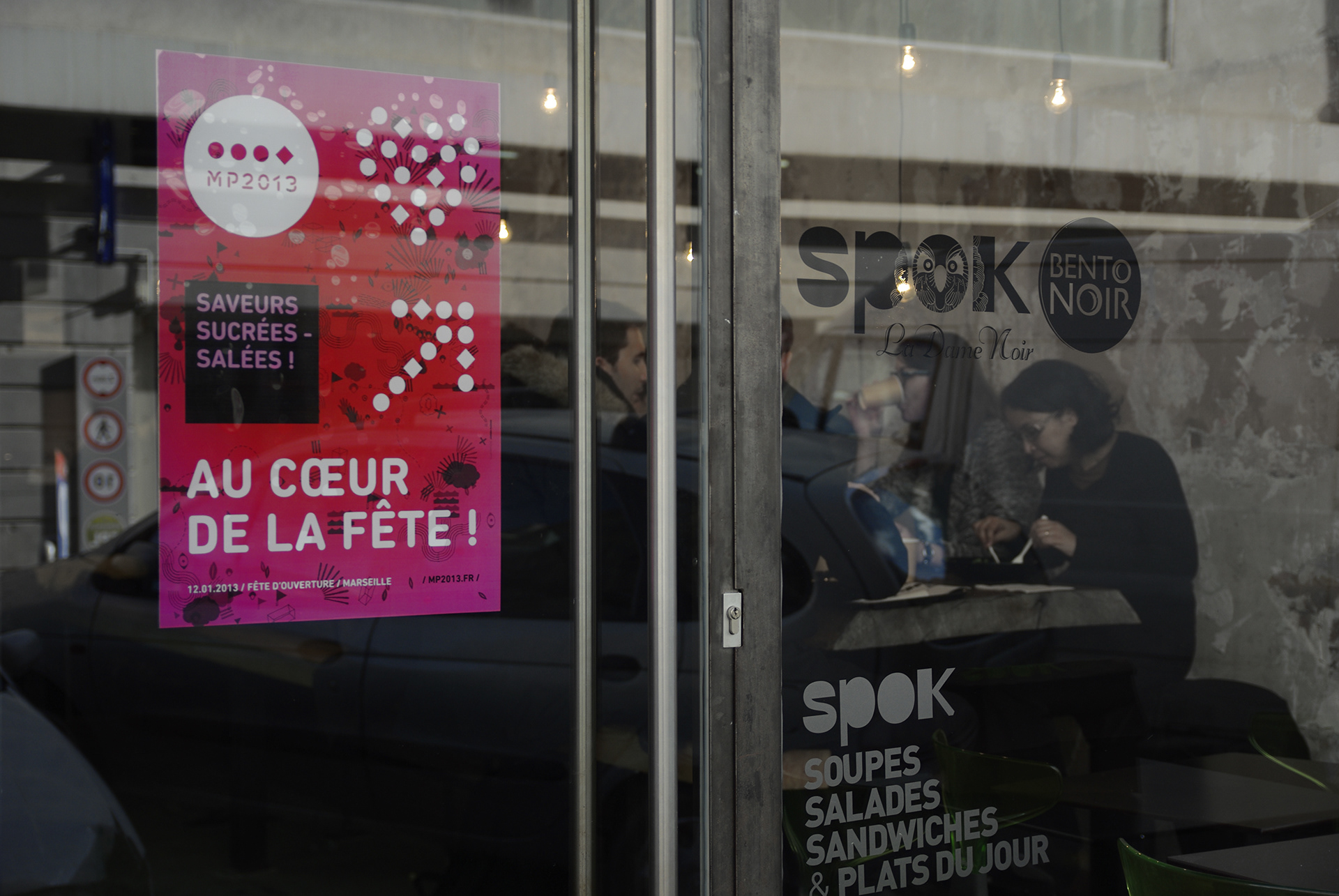
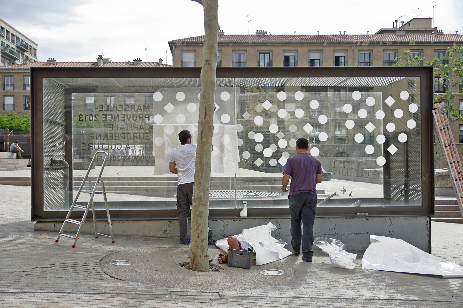
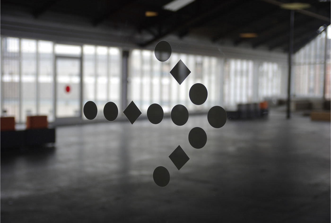
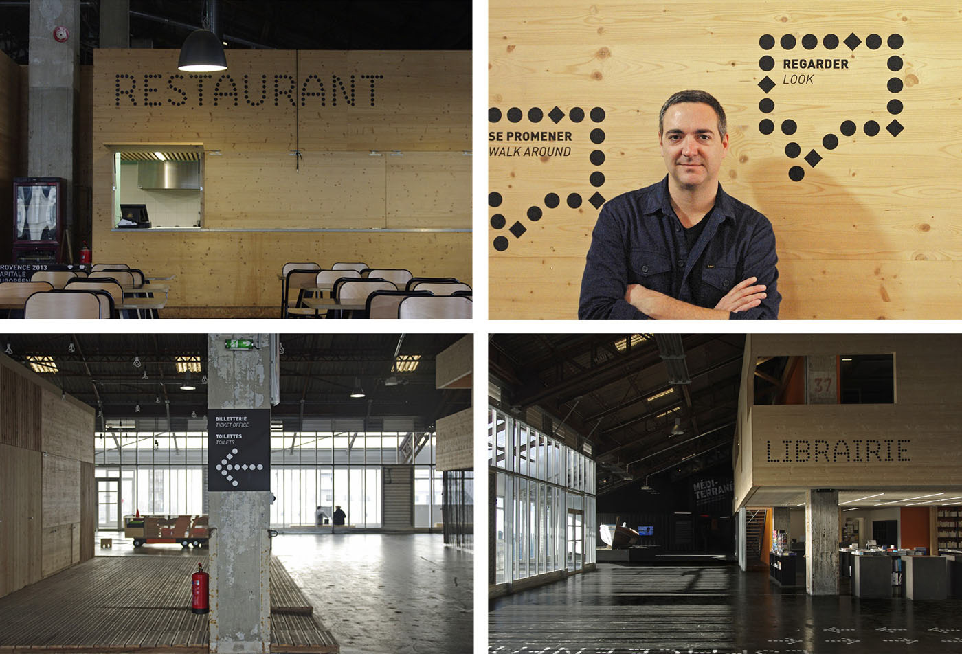
The identity is based on a typographical system. I designed a complete visual langage in order to provide maximum versatility and expression across every channel, format or material.
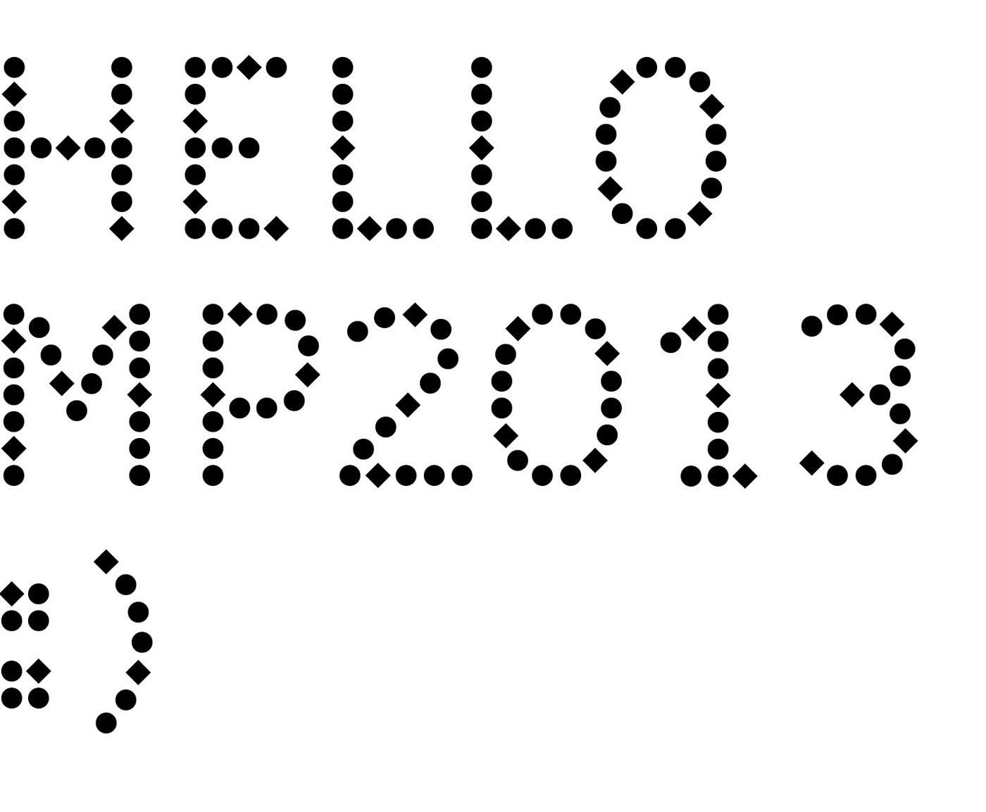
The typeface was developed with André Baldinger, adapting his B-Dot in which we introduced little "diamonds". The MP2013 logo itself consists in a very tiny hyphen, linking all the places, events, dates of the capital year.
The identity is based on a typographical system. I designed a complete visual langage in order to provide maximum versatility and expression across every channel, format or material.
The typeface was developed with André Baldinger, adapting his B-Dot in which we introduced little "diamonds". The MP2013 logo itself consists in a very tiny hyphen, linking all the places, events, dates of the capital year.